| ||||||||||||||||||||
|
|
| ||||||||||||||||||
|
|
| ||||||||||||||||||
|
|
| ||||||||||||||||||
|
|
| ||||||||||||||||||
|
|
| ||||||||||||||||||
|
|
| ||||||||||||||||||
|
|
| ||||||||||||||||||
|
|
| ||||||||||||||||||
| ||||||||||||||||||||
|
|
| ||||||||||||||||||
|
|
| ||||||||||||||||||
|
|
| ||||||||||||||||||
|
|
| ||||||||||||||||||
|
|
| ||||||||||||||||||
|
|
| ||||||||||||||||||
|
|
| ||||||||||||||||||
|
|
| ||||||||||||||||||
This utility is best suited to Linux platforms, because it uses xfig images. Suppose that you want to plot the curves for Foobar Pradesh. Follow these steps. Let us first look at the daily-data predictor.
- Download the C source file, and store it in a directory.
- Create two subdirectories with the names db (for input) and res (for output).
- Select a short name (like FB) for your region. This need not be a two-letter word. But avoid long names.
- Create a database file db/FB.dat. See the sample database files to understand the format. The first line stores the full name of your region (Foobar Pradesh). This is followed by lines each containing a date and the number of new cases on that date. The program assumes that the dates are contiguous and appear in the increasing order. Skipped dates will yield outputs not necessarily meaningful. Populate the database file by data from an authentic source (like this).
- The code has two modes of operation. If you want to find the estimates based on a number of days (like 30) that you would explicitly specify, do the following.
gcc -Wall predictor.c -lmIf the predictor does not fail on these values, a file res/FB30.fig will be created.
./a.out FB 30If you want the predictor to supply you the best-fit curves, do the following.
gcc -Wall -D_BESTFIT predictor.c -lmExcept in extreme situations, this would work, and two files will be created: res/FBBF.fig (best fit, daily cases) and res/FBCM.fig (best fit, cumulative).
./a.out FB- You can open fig files using the xfig utility. For converting to jpeg, you may run xfig as:
xfig -exportL jpeg -export_m 20 -jpeg 95 -smooth_factor 4 res/FBCM.figBut you have to export to jpeg (or any other supported format) manually. If you want to convert fig files to jpeg files from the command line, use the following.fig2dev -L jpeg -b 20 -m 1.25 -S 4 -q 95 res/FBBF.fig res/FBBF.jpgUsing the moving-average predictor is similar. Download the source code, and store in some directory. If you want to get w-day moving-average predictions, create a subdirectory maw. The pictures are dumped there. You should preferably take an odd value of w. Here is an example with 5-day moving averages.
mkdir ma5
gcc -Wall movavg-predictor.c -lm
./a.out FB 30 5
gcc -Wall -D_BESTFIT movavg-predictor.c -lm
./a.out FB 5
fig2dev -L jpeg -b 20 -m 1.25 -S 4 -q 95 ma5/FB30.fig ma5/FB30.jpg
fig2dev -L jpeg -b 20 -m 1.25 -S 4 -q 95 ma5/FBBF.fig ma5/FBBF.jpg
fig2dev -L jpeg -b 20 -m 1.25 -S 4 -q 95 ma5/FBCM.fig ma5/FBCM.jpg
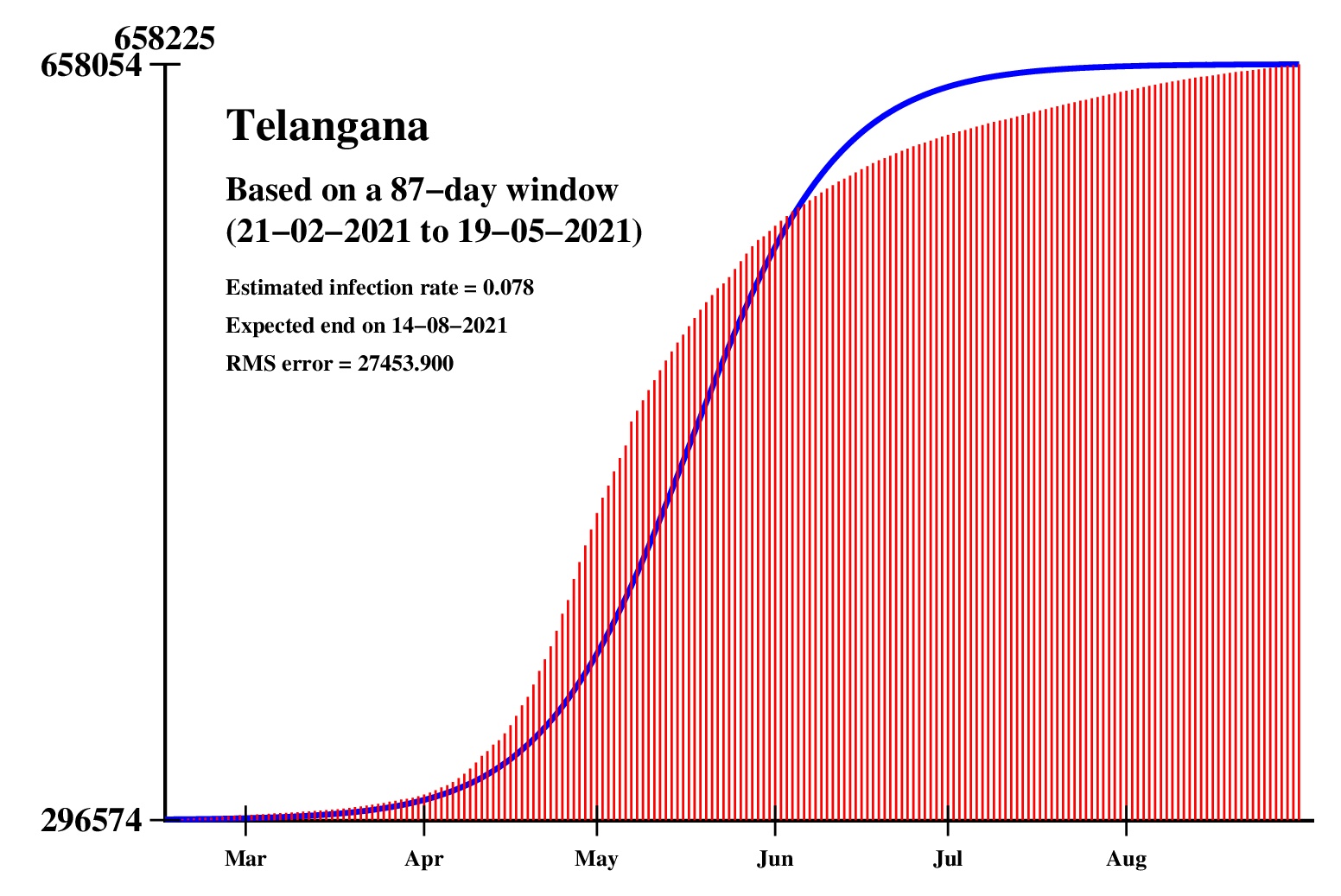
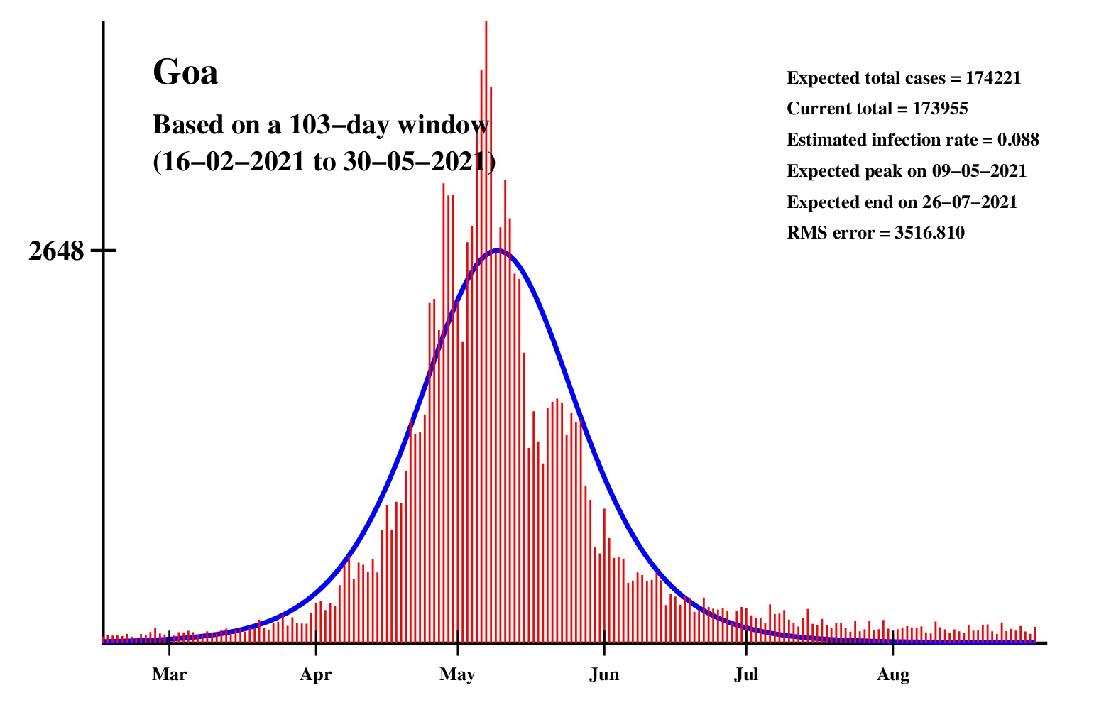
The logistic model and the nonlinear regression method are theoretically perfect. But the real-life data is too noisy to fit the theory gracefully. It is evident that no meaningful predictions can be obtained from these experiments. I am clueless how or whether more reliable predictions can be made possible.The concept of best-fit curves is based on the minimization of the root-mean-square error. The minimum is taken over all values of N in the range 30 to the total number of days for which data are available.
In order to smooth out daily fluctuations without sacrificing tracking the trend, the idea of moving averages is implemented. An odd-length window is used. The average is assigned to the central day of the window. Therefore the predictions for (2k + 1)-day moving-average method is actually k days old although it partially incorporates the data for the last k days. The daily-data predictions are essentially 1-day moving-average predictions.
The fixed-day predictions will no longer appear in this page. Only the best predictions will show. If needed, fixed-day data can be generated from the source codes.
These curves should not be considered as time-invariant. They evolve as more and more new data points are available. The predictions of today may be significantly different from what the program will do after a week (since seven new data points will be available by then). This model does not capture (neither does the SIR model) population size, density, mobility, age distribution, and so on. All these factors are clubbed together in a single parameter called the infection rate.
This is a free-lancing activity conducted solely by me, so far. Constructive suggestions are very welcome.